
Page 271 - AI Computer 10
P. 271
DATA VISUALISATION IN PYTHON
The Matplotlib package in Python is used to visualise data using a variety of charts or graphs, also called plots.
The pyplot, a sub-library of Matplotlib, is a collection of functions that helps in creating different types of charts.
The different kinds of plotting the data using this package are as follows:
u Line Plot: A Line plot or a line chart is used to visualise the relationship between two variables by connecting
data points with straight lines. The data points are represented by two variables, X and Y, each on a different
axis. It's particularly useful for displaying trends over time, making it a common tool for time series data.
u Scatter Plot: A Scatter plot is also known as a Scatter graph. It uses multiple pairs of two variables – X and Y,
represented by dots represent the relation between the two variables. Scatter plots are used to represent
discontinuous data.
Some common elements of Matplotlib plots are:
u Axis Titles or Labels: Axis titles or Labels help in describing the values plotted on the individual axis.
u Chart Title: This is a descriptive name given for the content of the plot.
Let us learn to create a line plot and a scatter plot with the help of examples.
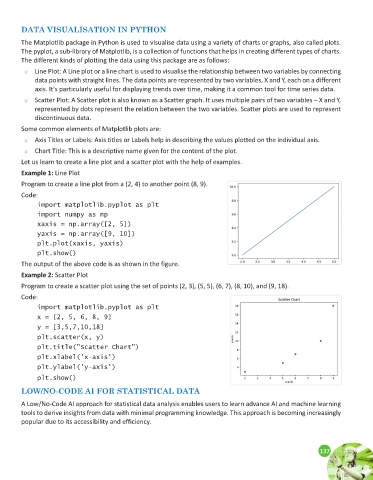
Example 1: Line Plot
Program to create a line plot from a (2, 4) to another point (8, 9).
Code:
import matplotlib.pyplot as plt
import numpy as np
xaxis = np.array([2, 5])
yaxis = np.array([9, 10])
plt.plot(xaxis, yaxis)
plt.show()
The output of the above code is as shown in the figure.
Example 2: Scatter Plot
Program to create a scatter plot using the set of points (2, 3), (5, 5), (6, 7), (8, 10), and (9, 18).
Code:
import matplotlib.pyplot as plt
x = [2, 5, 6, 8, 9]
y = [3,5,7,10,18]
plt.scatter(x, y)
plt.title("Scatter Chart")
plt.xlabel('x-axis')
plt.ylabel('y-axis')
plt.show()
LOW/NO-CODE AI FOR STATISTICAL DATA
A Low/No-Code AI approach for statistical data analysis enables users to learn advance AI and machine learning
tools to derive insights from data with minimal programming knowledge. This approach is becoming increasingly
popular due to its accessibility and efficiency.
137
137